

Michele, the owner of Posh Scraps in Palm Harbor Fl. gave me some of the PAINT IT! papers by Creative Imaginations to play with today. Samples, layouts and demos sell product and this one practically sells itself. While it is designed to be used with Luminarte paints, I tried out a few other colorings with mixed results. Here are my efforts and my ratings.
 While I adore TH's Stains, this is not a good match. The keys do not show and the residue of the stains flaked off in sections. I'll keep using my Stains but not on this paper.
 My next coloring agent were the Pearlscent Watercolor paints by Yasutomo. I love the look of them everywhere and they even turned out pretty on the paper but failed to pick up the 'hidden' keys in the design which is the purpose of this paper.
 The paper product states "Paint It! with Luminarte so, of course, this is the premiere product to use. I have been a huge fan of these paints going way back and the metallic is so pretty...and VOILA! there are the keys.
 I used a Tombow Dual Brush on the one above and LOVED it. I had tons of control and could go back over and over to darken if I wished. This is a winner too! I am sure other brush markers would work well also. I know Prang makes some metallic ones that are beautiful.
 I learned about Lyra Aquacolor crayons from Regina at Owl and the Pussycat Stamp Art Store in Ft. Myers, Fl when we first moved there in 2001. I still have my original 12 and they look almost as good at the day I got them. On the Paint It! paper, they appear subtle and the color can be made darker or lighter depending on the amount of water one uses to apply them. I would use these on the paper as I like the soft look.
 Chalk Inks worked amazingly on the Paint It! paper. I heat set the ink and the paper stood up well under heat from the gun.
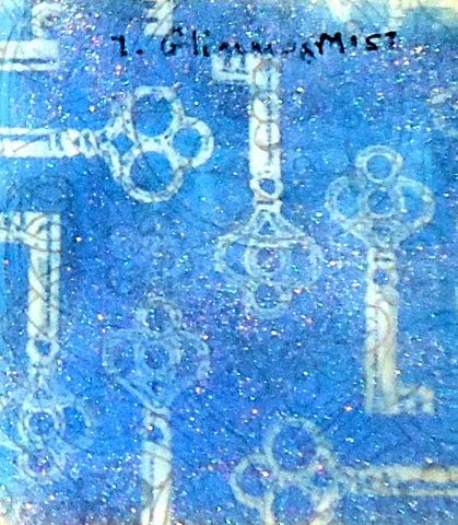 I painted on the Glimmer Mist rather than spritzed it. I feel I have more control over the glimmer this way. I love the sparkle it gave the paper and the degrees of color coverage on the keys.
 This metallic ink by Tsukinneko was also a winner and heat setting it just brings out more of the glam.
 And my final winner is T. H's Distress Inks. They give a soft matte finish to the paper and yet the keys show beautifully.
I would love to see what color products you use on this paper that has so many uses. My sampler will be up at Posh Scraps and Michele got in a wide variety of the papers...this is just one of the beautiful patterns. And Michele has a surprise coming in May so save May 16th.


